Client: Wax Lab Company
Background: Wax Lab Hair Removal Experts. They manufacture the top selling cold wax in the market, also known as sugaring gel or paste under Sweet Solutions brand.
Status: Ongoing
This is a local based project here in Manila and currently on its way to finalizing and delivering other design outputs needed for Wax Lab Company and Sweet Solutions Beauty Lounge.
You can follow my instagram at www.instagram.com/hellouhansel and there you can view some of my post about this project and its progression from sketching of ideas to coming up with rendered versions of the logo.
The main idea for the Wax Lab Logo is to put an emphasis on having the natural or organic ingredient in their wax product. The flask was adopted from their previous logo (shown below) and have it re-imagined into a much simpler one. The leaves symbolizes Wax Lab's use of natural and organic ingredients in their product which is the Sweet Solutions.
The client wanted to retain their existing color scheme which is inspired by the brand L'Occitane. Another interesting input that the client requested is to have a different flask made and putting the leaves in the Wax Lab logo and placing it in Sweet Solutions as well.
My final take on this design project - I had fun working and developing the logo and I still have pending outputs for them :)
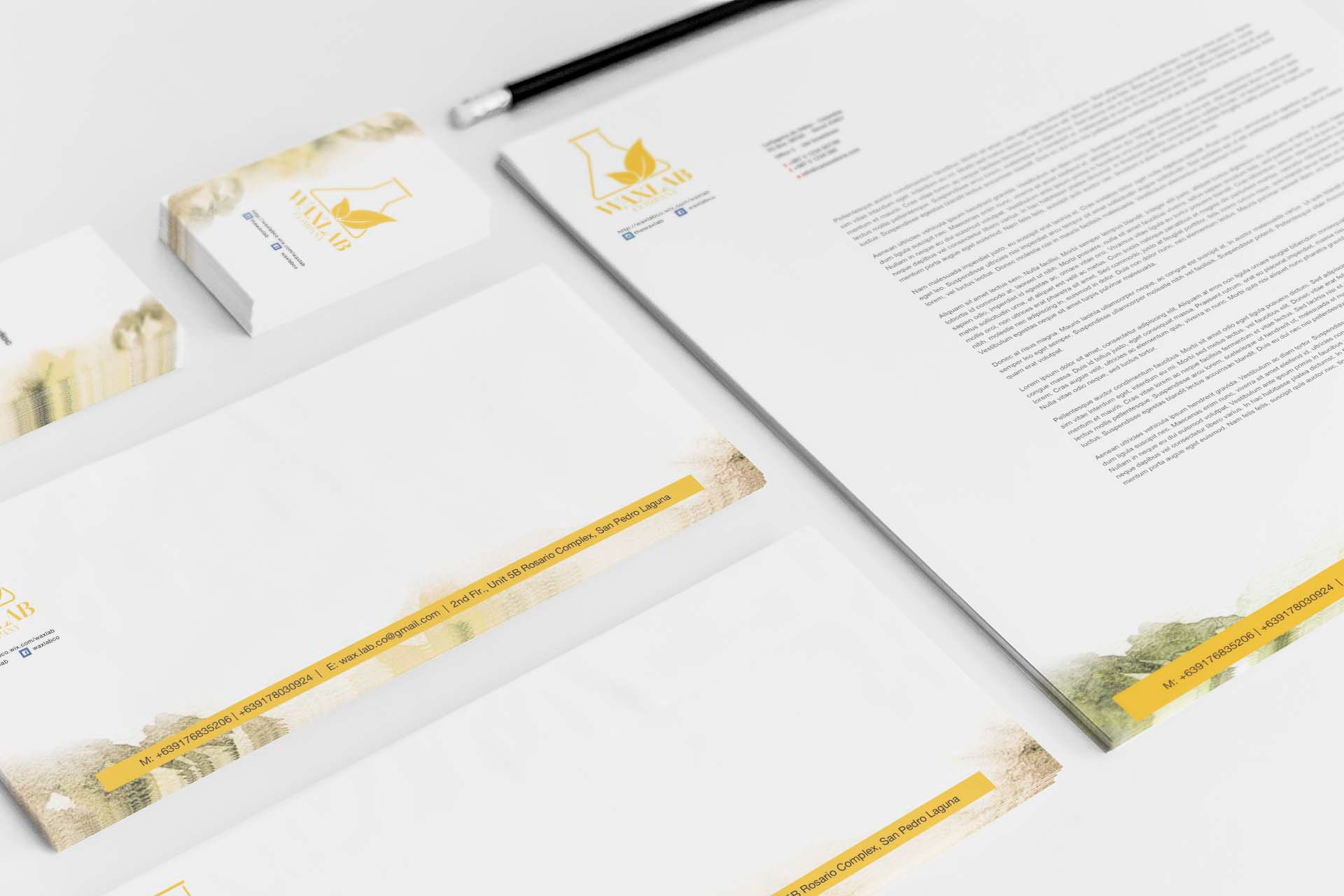
Wax Lab Company's Corporate Collateral Mock-up.
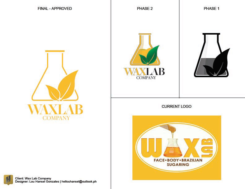
Logo Development Phase of Wax Lab Company.

Proposed signage for Sweet Solutions Beauty Lounge. Notice that the typeface used in the signage is different from the approved logo of Sweet Solutions. This will be part of the branding bible do's and don'ts.
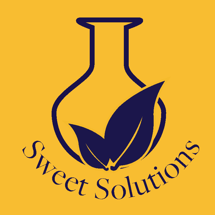
Sweet Solutions Logo