
Test Case Background:
This year Getz Healthcare will be implementing a new CRM system, for their Sales and Marketing Teams to use. The system will be implemented across the 9 Asia Pacific countries we operate in; Australia, New Zealand, Malaysia, Taiwan, Hong Kong, Vietnam, Pakistan, Philippines and Thailand.
Salesforce ( https://www.salesforce.com/ap/ ), is the CRM system that they will be implementing. However, internally they will be re-branding the Salesforce system under the name of G-Force.
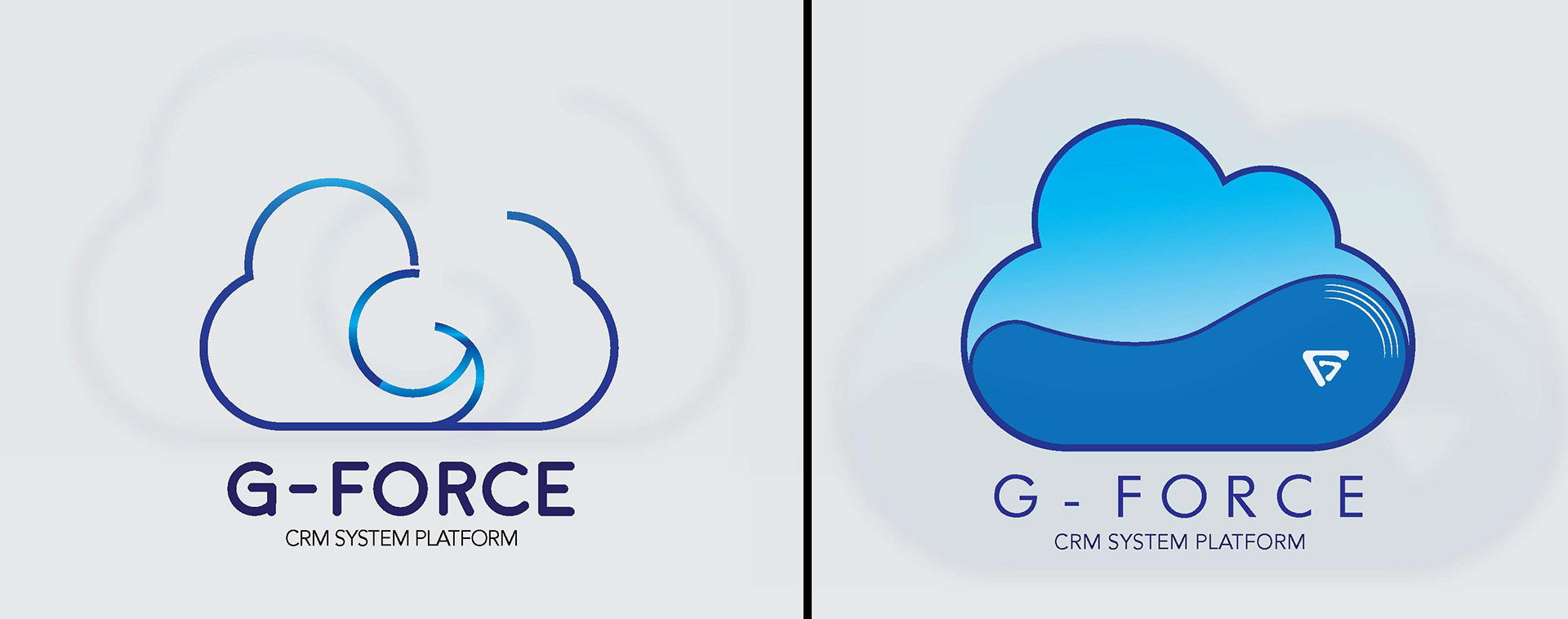
My idea is to retain the current cloud logo of the Salesforce but coming up with my own cloud design. First logo on the left side is basically a hidden G in the cloud. I wanted to have simple treatment for corporate or business type of logo. Played with different color blue schemes. Second logo on the right side is a bit playful yet it can pass as a corporate logo. Made a research on some of Getz businesses and found out they do incorporate lines on their logo. The white lines were inspired of the lines present in Getz Brothers current logo. There's also a G icon in white seen in the logo but if you will look closer, a letter F is formed in the negative space of letter G.